The scatter chart allows you to create a chart showing one piece of information, such as market capitalisation, along the x-axis and another piece of information, such as P/E ratio, along the y-axis, as in the example below. Each dot represents a company, and its position shows the Market Cap and P/E ratio of the company.
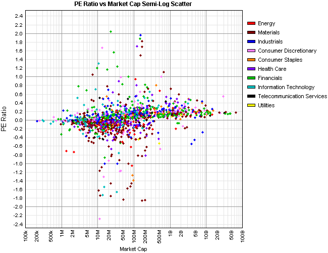
In the example above, the colour of the dot is used to represent the industry sector of each company. Colour can also be used to show movement.
Use the drop downs at the top of the page to adjust what the x-axis, y-axis, and colour represent. Note: If you specify the same value for the x-axis and the y-axis then the dots will appear in a thin diagonal line.
You can either use the scatter chart to identify correlations between various security statistics, or you can use it to visually search for companies that have these statistics in a certain range.
Hover the mouse over a dot to see what company is represented. The company name and ASX code is shown to the right of the chart. Click on the dot to see security details for that company.
Sometimes one or two companies may have a particularly large value that distorts the entire chart. This would appear if many of the securities are tightly bunched in a horizontal or vertical line. Click Limit X range if they are bunched in a horizontal line, or Limit Y range if they are bunched in a vertical line. This option causes the chart to rescale and only show data up to two standard deviations either side of the average. Note that not all securities will be shown if you have these options ticked.
Some types of values are represented on a log scale. This means that the scale increases exponentially. Log scales can be identified by their grid lines that are at inconsistent spacing. This is normal.